321.555.5555
@hannahpatellis


Hannah A. Patellis Self-Branding
When embarking on my self-branding I wanted to create an identity that was sophisticated, simple, and expressed me as an individual.
The first task I came to was to create a logo of some kind that would be signature. I played with simple text-only logos with my name but none of them were memorable enough. I toyed with using my initials, HAP, but eventually settled on something more uniquely me. The H in the logo is the way I write my H when signing my name. It was unique, signature, and simple.

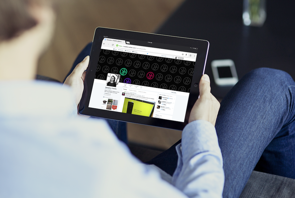
The design needed to be simple but express who I was as a person. I chose a color palette that would be bright and placed it on black to keep the design clean, but yet have an energy to it.
The "wave" marks found on branding material and along the bottom of the site were used to include motion and was based off fingerprints. When designing I wanted to encompass my love for user interface design and decided on relaying touch in an abstract way.
The branding needed to encompass me as a person, so when working on the bio page I decided to make my own persona. Personas are a common practice in service design and what more fun way to talk about myself than using charts and graphs. A taste of me, and a taste of my service background.
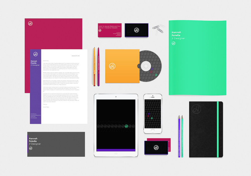
While working on branding, I used Adobe After Effects to create a short clip displaying the logo and branding elements. It was both to be used as a promotional tool, but also was a good exercise in how the elements in the branding work together.